A lil' history:
This was a collaboration with the CARE team that organizes the exclusive Cast Members heritage events for the Walt Disney World. Further, every year, some of the Cast Members participate and compete in the Canoe Races of the World, also known as C.R.O.W. This annual race originally started in 1963 at the Disneyland Park as a part of the Recreation club, later became Cast Activities. Later on, the race has been introduced to the Walt Disney World in 1973 and has been the cast favorite ever since. This specific event became so popular that it has been passed to all Disney parks around the globe with each park having it's own unique version to call their own.
For this year of 2020, Princess Tiana became the mascot and the branding persona for the event. Therefore, I designed a logo, which got reflected over various mediums, including a collectable enamel pin, TV/Web Slides, and bunch of signages for the actual event. Further, Due to an intense copy write restrictions, I decided to hand-letter the title around an approved illustration of the Princess Tiana.
In the process of creating the artwork, I became familiar with the pin printing process, restrictions, and timelines. This specific project, like the rest of the Disney related works that I was part of, became delayed due to the COVID-19 and hopefully will be put into production right after the quarantine.
Spring 2020


DALPHIN
My role: UX Research,
User Testing, User Research, UX/UI Design
This project is a part of the User-Centered Design & Development course offered through the Computer Science department at the University of Colorado Boulder. The goal of the Dalphin app is to help incoming academic students to find tailored matches of academic schools, as well as perfect locations. Not only this platform can be utilized to find personalized options, but also help parents/mentors engage and keep track on their kids/mentees who are looking for career and travel advice. This concept especially is in need by international students who are looking for elevating their career development in a more advanced way.
Course & Time:
CSCI - 5839
at the University of Colorado Boulder
Instructor - Shaun Kane
Fall 2022
Tools:
Adobe illustrator
Figma
After Effects
Media Encoder
Google Forms
Proposal
Elevator Pitch:
During the Dalphin project, I would like to create an online space for
prospect students to find the most suitable option for their Undergraduate or Graduate education and location by completing a shot questioners and filtering system. As an international student, I would also like to allow people with my background to be able to find resources without the stressful process of searching for what is required or having to read complicated school catalogs in non-native languages.
When I was 15, I was studying in the second to last year of high-school
and had to figure out my university education. Fortunately, I have a very
supportive family and I was encouraged to travel abroad to get my academic education with better resources, since the education level back home is no where close to the levels in the other parts of the world, including the Middle East, United States and etc. Therefore, as I was preparing my English levels, as well as trying to find a suitable university or, 2 years ago, the most efficient graduate school, I went through a very complicated process, as I was researching on my own. My first attempt on finding a Graphic Design major in a university in the Middle East resulted of me to study and compete for the Multimedia Design major instead of Visual Communications major, which is the more modern name for Graphic Design, due to the lack of language knowledge back when I was a teenager and a very challenging catalog language on the university website.
Additionally, I also had no clue on what type of study fields existed that
would have made me have an idea which career to pick for the rest of my life, again due to the lack of recourses or education awareness back home. Therefore, I gravitated towards what was familiar to me and my family to decide my future path. In Dalphin, I would like to eliminate all this hassle for folks who go through the same experience.
Target User Group
The main user group for this project could be the prospect and current
students in the academic education systems. Having the resources such as diverse friends and family from various locations/continents, I would like to focus on getting data from them and ease the process for future generation of students. I would also like to focus on the international students with, English not being their native language, to also be encouraged just like my family did, to get out of their limited resources and find a better future. Not
only, I would like to help students find the most compatible institutions but
also figure out which filed option actually would be beneficial for them and make them happy as well.
Versions
With Dalphin, I want to allow users to access the space with an online
platform, especially mobile phone friendly access, since some population in underdeveloped countries don’t have access to computers or laptops. Additionally, in some families, parents are also involved in the university
match making process to help their kids. In this case, I would like to offer
parent view as well, where they could also monitor which option would
match with their family resources.
How this project meets the theme
While building this app, collecting data about which factors are mandatory in the application process, as well as the transition to certain campus is very crucial. By observing the needs of students, as well as universities from each other is another important point to satisfy the needs at the end. Further, using this app could also create a new set of data on which majors or universities rank in certain ways of user choice.
3 Interaction Design Challenges
The first potential design challenge would be how broad this app could offer match making services. Meaning, there are not only just undergraduate and graduate education, but also Doctorate, Research Doctorate Degrees, Postdoctoral Programs, different levels of Medical programs, and so on. Since, this project is a prototype of a platform, I would have to focus on the quality of the resources. Having a lot of educational branches might create further complications or general challenges to create an algorithm for.
The second challenge would potentially be simplifying one of the most tedious and stressful processes into a very simple, straight to the point information for people with lower language levels. Personally, preparation process for application and location requirements takes very long time, where making sure to find the right links with right information on the right time creates countless email or phone exchanges between students, parents and institutions. Sometimes families reach out to outside resources or companies to help fill out the applications for kids as well. Distilling this process into something way easier and shorter term is definitely a big goal and challenge at the same time.
And of course, the more advanced challenge is actually building a quiz-like algorithm for users to fill out in order to filter through personalized selections to achieve the goal of finding a major, as well as location in Dalphin. From a recent reading, with a topic about the “IKEA-Effect”, it is documented that people like and prefer customized processes and products. Therefore, customizing a crucial life choice through series of questions would bring a lot of challenges to figure out the outcomes.
User Research
Questions
1. When and how did you decide to study in a university/graduate school?
2. Approximately, how long did it take you to complete an application process for a university/ graduate school?
3. How many schools did you apply for at once, for one academic year?
4. Were you satisfied with the choice you made for your academic studies? (Meaning, were you certain that you
made the right choice for your major and school/location?
5. How were you influenced to pick a career path through school?
6. Did you travel and relocate for university/graduate school?
7. Did your parents help you with the admission application process?
8. Did you decide to experience your academic education in another language?
9. Which sources did you use to get help with any questions that came up during the process?
10. Did you change your major during your studies due to any reason?
11. Which point of the following list played a crucial role on deciding your major and school:
Financial circumstance
Parental Support
Location
Deadlines
Accessibility
Pre-existing interest
School ranking
Financial support through school
Ranking of curriculum
Following a family member footsteps with either school or major
12. What emotion or memory resinates with your time during filling an application process?
13. What one specific thing was unexpected for you during the filling an application for school?
14. Please give one example on how could this process be improved to help prospect students.
15. How did you fill up your application for school/schools?
Self
Parents did
Applied and paid for a company to fill in the application
Other
In Person Interview
Notes
More Online Interview Results


Executive Summary
During the research for Dalphin, I got the chance to interview 7 friends and family with distinctly different backgrounds. I was able to gather data from both international and US nationalities that also had experiences with both undergraduate and graduate school application processes. To conduct my research, I used Interview and online Google Form methods to ask questions related to this project either by having a in person conversations, zoom meetings, and online communications with my international friends that live in different timezones. I decided to ask 15 questions about their experience with academic schools and application process to get more data on what they found challenging or general emotions as well.
Throughout my conversations with my subjects, I found a lot of commonalities, but at the same time complete opposite or different answers as well. Most common similarity from the overall data was how stressful of an experience it is to find a major, as well as school, especially for international students when they are just in high school. Further, it was surprising how some people from this research already knew what they wanted but most either depended on cultural/family influences or needed to be more employable for better pay. Another interesting outcome was how some subjects used up to 3 month to fill out an application form and others just few hours. These stark differences also influenced by them being either a native or an international student who has to go through 2-3 times more documentation process just to be able to count eligible. It is also important to point out that some people also had their parents as guides or influences which they also helped their kids to go through this life changing process, where others didn’t. Most of the subjects I interviewed also experienced their academic lives in a different language than their native one. Additionally, it was also apparent how some subjects applied to 1 school for the following year, on the other hand, others did up to 11-12 schools for one academic year as well. When it came to getting any information or answer to any questions that came up during the process, subjects had their family, friends, school consolers, university websites, and google as their tools to navigate throughout the process. It was also interesting how most of my interviewees were somewhat satisfied with their choice of major or school, very few were satisfied and dissatisfied as well. Most importantly, location was the most common reason/influence for subjects to choose their future plans with academic studies. Next, was School Ranking, Financial Support, Parental support, and Accessibility. The least common element for these subjects were Deadlines and Following a family member’s footsteps into a certain school or major. I also decided to get more emotional insight on how did these interviewees felt during this whole transition process from high school and most answers revolved around being scared, anxious, stressed, and excited. And lastly, I also was curious on what did they think could improve the process they went through and one of the interesting pints was how this whole transition process should be talked about with more guidance from a younger age through schools themselves or even mock interviews for students who are trying to get to more higher level of academic school.
Overall, these conversations brought a lot of expected and unexpected results for my research. I was able to understand what went into the process of applying for majors or schools from very different perspectives. I was able to see the behind the scenes of many different challenges that the subjects went through. Especially focusing on the international application process also added another layer of concerns for experiences of prospective students.
Personas


Scenarios
Student/Mentee View
A high school student named Dina is about to finish school in a year. She is planning to go to college due to cultural traditions and encouragement from her family. Dina is trying to study abroad, especially in the US. She is originally from Lebanon and doesn’t know what her options are in different study fields or which schools are possible for her to transfer. She has resources for her to find a school inside her country through her high school or family but she has no idea how the process goes in the United states. So she downloads Dalphin to her phone and starts taking some short quizzes to find out which major or school would be a best fit for her and accommodate her background. After completing the short questionnaire, she gets access to bunch of school or major options where she can add to her profile to keep record. Each school displays all the necessary requirements from needing SAT/GMAT scores to tuition rates for in-state/out-of-state/international rates and many more to help her keep track of her applications. Later on, she uses her profile and saved information to check off the list as she starts applying.
Parent/Mentor View
Dina’s dad is extremely supportive of her choice of going to a university and likes researching schools for their rankings, tuition rates, safety, and many other information to find a best fit for his daughter. He is mainly concerned about financial expenses during the process and wants to make sure he helps his daughter with filling each application correctly. Therefore, he also downloads Dalphin to his phone and starts taking short quizzes based on his own interests. Once he gets more information, he now can share his findings with his daughter and transfer any information needed to Dina’s profile. After connecting with his daughter, he also can keep track on which schools Dina already applied and which ones are pending so he could be extra cautious not to miss any deadlines.
Low Fidelity Wireframes

Final Prototype
Student/Mentee Searching Majors

Parent/Mentor Searching Shcools

Storyboard & Final Demo Video


Interactive Figma Prototype
User Testing & Revised Prototype
User Testing Script
This is an app focused on helping users such as young teenage students or people who are looking for higher academic schools such as Graduate and PhD programs but don’t know where to start or what to do. This platform also helps people get customized matches of what type of major they might be interested in, especially for those who are in high school and don’t know who to become. Dalphin also offers a mentor and mentee connection via the app by connecting prospect students with their parents or mentors to track progress or help each other out to find the right match at the end.
For this user testing I would like you to achieve 3 paths to learn about how this app works:
1. Try to explore searching for majors as a prospect student and open up your suggested school profile
2. Try to explore searching for schools as a parent for graduate student and reach all the way up to the Track Mentee page.
3. Try to connect mentees and mentors to one another and find a pop up information page about IELTS, TOEFL, GRE, GMAT.
Please talk through each step you take and what it makes you feel or think about.
Suggested Changed/Feedback
-
Home Page functionality could be improved
-
Flow could be improved
-
Missing Back buttons
-
Missing Skip options
-
Copy language could be improved with a humanly language, rather than serious
-
Filter Locations based on proximity to airports
-
Extracurricular options for schools
-
Profile connection is a bit confusing
-
Navigation arrows for quiz could be added
-
Application deadlines/how many days left
-
Priority scale
-
Schedule a reminder instead of sending it now
-
Work on language
-
Dot navigation in the beginning is hard to use
-
Skip option to not do the quiz and go to the profile
-
Add a label/title to Profile Sign up
-
Separate the connection of profiles to a new tab
-
Add labels and names to the Majors & Schools
-
Connect terminology between initial questions and quiz
-
Preference are complex, make them friendly
-
Sliders on tuition
-
Instead of a dropdown what could be a better way?
-
Matches count that updates throughout the app
Personal Notes during Research & Testing
User Testing Summary
Summary of feedback from User Testers:
-
Why next instead of yes on first 3 questions of the app?
-
Prospect student should be up and parent down to match the test objectives
-
Sign in layout is very unique, might be confusing for first time users
-
“I don’t like clicking the small spaces, such a circles on the prospect student vs parent options. Instead I would like to tap on the icon and select the options”
-
“Pick as many a you like” message is a little hidden, I have missed looking at it at first”
-
For the questions of the quiz part of the app, the language could be improved to maybe which one is more important?
-
Using “Meh” as an option could be updated into something more clear.
-
“Instead of circle button, you could type up “See Matches” to let users know what to expect.”
-
For missing the deadlines, I would like to be informed that I am about to miss a deadline, instead of getting notified afterwards.
-
Footer navigation needs a bigger tap space, meaning the text also should be clickable for bigger fingers.
-
Connect icon on the footer could be more informative, it seems a little vague.
-
Adding official links to the resources should be super helpful
-
For invitation of the users with check marks next to them makes sense, however, having an x to the users seems like something went wrong. To indicate that the connection hasn’t been complete yet, you should use another icon.
10 Heuristic Evaluation
1. Visibility of System Status
Beginning 3 Introduction Pages - Dalphin gives a guidance on how the app will benefit the user and guide them throughout the way.
Sign Up Page - In my initial design I was missing a guidance or clear communication of what this page was all about. After conducting user testing I was pointed out to add a title/label for the page to be more clear.
2. Match Between System and The Real World
Throughout the App - I tried to use minimalistic yet highly representative visuals to match what they imply to inform. Meaning, for example, I designed simplified icons of representations such as a school for finding school matches or a diploma with a graduation cap for major matches and etc throughout the app.
Suggested Schools Page - In the initial design process, I was missing a clear representation of school/major suggestions and after communicating with user testers, the real time logos of each school was agreed upon to be the most representative of each section of information.
3. User control and Freedom
Throughout the App - In this app I have used navigation systems such as Skip, Back, Next, Finish, Search, and many more to help users to use the app without intimidation to navigate through the pages.
Throughout the App - After almost every testers of the app mentioning the missing back or skip buttons, I integrated them to the updated design to avoid frustration or poor experience.
4. Consistency and Standards
Throughout the App - Dalphin uses various ways of displaying information and navigation. Meaning, there are different representations of the buttons and choices to keep users engaged and interested by introducing new ways of navigation system on most of the pages.
However, all of the elements uses specific colors, no more than 4-5, and having the blue to be the dominant color of the whole app gives a cohesive connection between each elements. Not to mention each information field uses specific hierarchy of font sizes and thickness to match with the ret of the similar information.
5. Error Prevention
Throughout the Quiz part of the App - I decided to add a subtext of “Pick as many as you like” at the bottom of the questions on some of the pages that require multiple choices. This way I am able to help users to prevent making errors on how many choices they might have on all of the pages that require specific outputs.
Add Mentee Page - In this particular page I was missing a clear indication of how the profile connection worked initially. Therefore, on the updated deign I added simple icons such as a checkmark, as well as an X icon
with corresponding color palette to warn users of who
is connected to their profile.
6. Recognition Rather Than Recall
Throughout the App - I used standard navigation systems such as a footer, hamburger sign, literal QR code icon, search field, even labeled input boxes/buttons to help users understand what is asked of them
Personal Information Sign up Page - In my initial prototype I only had one button forcing the user to sign up for the app. After many similar feedback indicating of having a more robust sign in/sign up options in the same page I decided to add other sign up options. This way I allowed users to sign in to the app in the most convenient and similar way possible to help them use their own preexisting data and save time.
7. Flexibility and Efficiency of Use
Throughout the App - I was lacking the flexibility of having a skip button, specifically. I was asked to integrate this option for users who are not interested in taking the quiz and skip all the way to the actual app. Therefore, I integrated the skip button to the app ask much as possible.
Quiz Part of the App - I am always fascinated by the breadcrumb feature of any digital space. This not only helps users to understand how many steps they took to get to a page, but it also allows users navigate through previous pages with recognized pace.
8. Aesthetic and Minimalist Design
Throughout the App - Using only 2 primary colors on UI elements of the app accompanied by an abundance of white space is achieved in this app. Also sectioning the information into digestible sections and especially integrating an accordion folds into much more complex information creates aesthetically neat layout.
Quiz Part of the App - I think that in the initial design of the app, I used this minimalistic approach way too much, where all of the questions were laid out in a list of information with no visual company. This caused confusion of what is the comparison between
each information. Adding visual cues with simplistic design create a more legible visual information.
9. Help Users Recognize, Diagnose, and Recover from Errors
Suggested Schools Page - I tried to implement an error message to show another useful feature of how some of the applications might be too old and might have been missed by the user.
Throughout the App - I avoided to let users get to a point where they might make a mistake. Instead, I wanted to create a friendly system that became a template to use, instead of freestyle the navigation.
10. Help and Documentation
What Resources Are You Looking For? Page - Since I am focusing on international students and admission process for them, I had to add English Proficiency testing requirements as one of the sections of the quiz. Therefore, it was really important to also add what they actually mean for the users who have not seen or heard of the these crucial admission requirements before. Therefore, I aded a pop up menu with a question mark to let the user know about a recourse built in the app.
I was definitely missing an explanation of this section in the initial design of the prototype making people with US nationalities get confused as well.
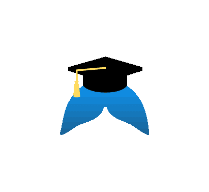
Branding & Visual Design
DALPHIN
The name DALPHIN was inspired by one of the most intelligent animals who are Dolphins. I witched the letter O to A to emphasize on the academic influences of this particular project.
Colors
#0D98F8
#FFDB5F
#FFFFFF
#000000
#C4C4C4
Visual UI
Fonts
Open Sans - Regular
Open Sans - Bold